Design is a word that’s come to mean so much that it’s also a word that has come to mean nothing.Jony Ive
When we talk about smartphone design, we often say and hear things like, “design is subjective,” “design is a personal choice,” and so on. Yes, design is polarizing. Almost every smartphone design poll we put out at Android Authority divvies people up into opposing camps. But there are times when you just have to come out and appreciate something for the good it brings. In the case of the Nothing Phone 1, it’s the design.
Check out: The best and worst smartphone designs from last year
Jony Ive’s quote above perfectly describes the problem with how smartphones look these days. Very few phones can truly distinguish themselves from the rest, even less so when big brands and their sub-brands simply take the same design and slap a different name on it. I’m looking at you, OnePlus, Oppo, Realme, and Xiaomi. While phones, especially in the mid-range segment, boast many so-called design feats, most of them fail to go beyond tweaking rear cover colorways, textures, and the camera module shape and placement. Design truly has come to be a word that means very little in the smartphone landscape.
It’s like a notification system on steroids.
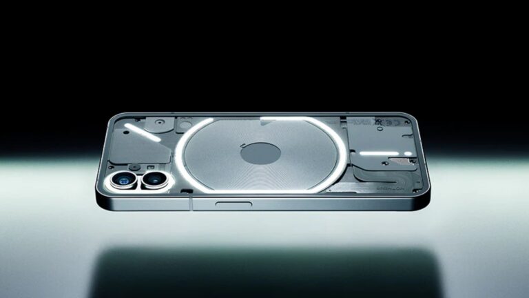
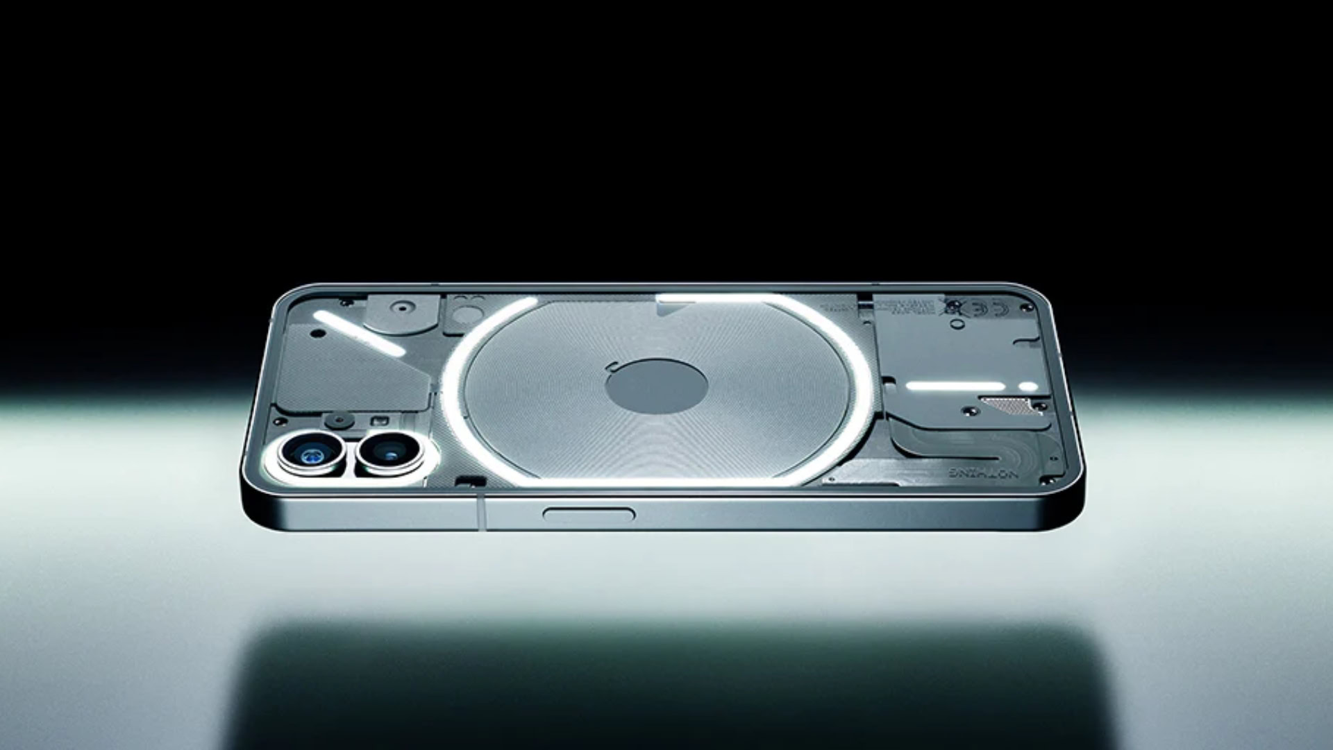
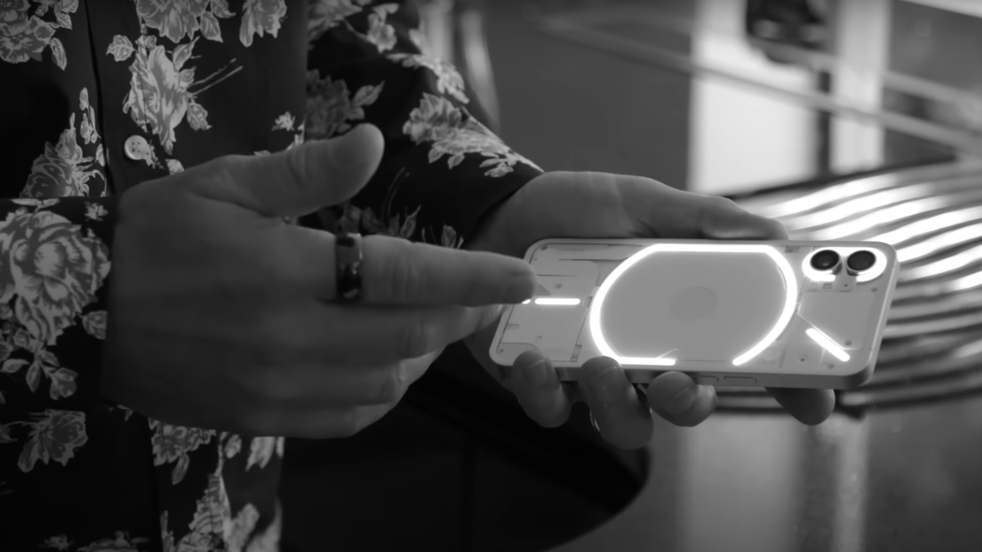
And in comes Nothing with its transparent back and the “Glyph” interface that looks radically different from anything out there right now. In dictionary terms, the word “glyph” originates from Greek architecture, but its more modern meaning is “a symbol that conveys information non-verbally.” In the case of the Nothing Phone 1, the Glyph is something that conveys information without having to light up the display of the phone.
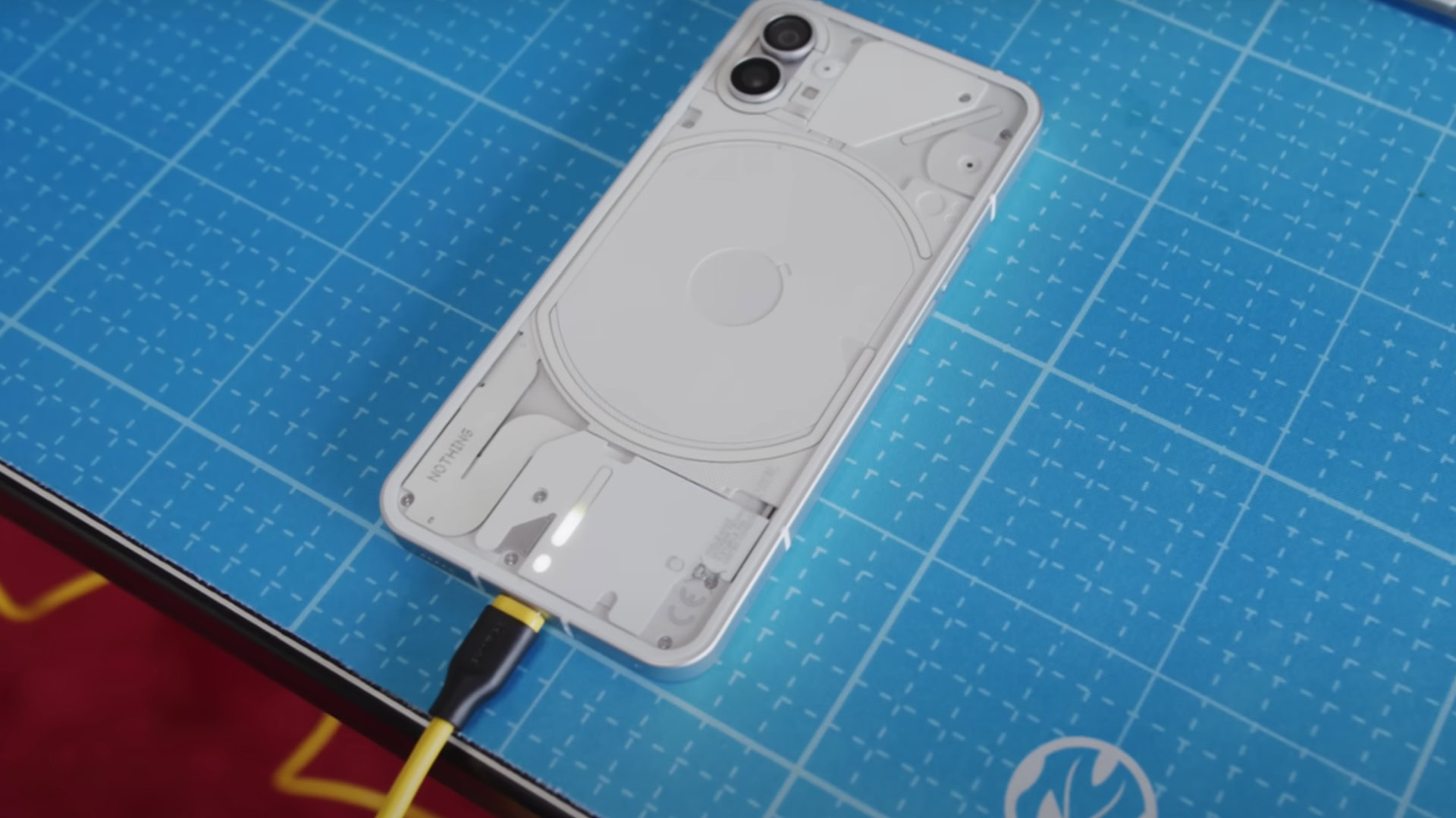
The charging indicator at the back of Phone 1.
The LEDs at the back of the device can beam in different patterns and sync up with different sounds. It’s like a notification system on steroids, pulsating for incoming calls, messages, app alerts, and more. I especially like the neat charging progress bar (pictured) that glows at the bottom of the rear cover. The entire thing can also light up at once to act as a fill light for the cameras. And thanks to Nothing’s community-led approach, the interface will be open for people to build more custom effects. That should be interesting.
Honestly, this is the most innovation I’ve seen in smartphone design in a while. Not only does the Phone 1 give us a peek under its hood, but it also has some fun features associated with its unique design. Unlike Xiaomi’s Mi 8 Explorer Edition, which peddled transparency but instead gave us a bunch of fake circuitry at the back, Nothing has created an eye-catching yet functional rear cover.
Nothing has created an eye-catching yet functional rear cover that shines in a sea of sameness.
Don’t get me wrong. I am not dissing all other smartphone OEMs and their design choices. The well-established brands make phones that appeal to the mass market, and in that, they have to more or less play it safe with their choices. That means equipping phones with a couple of cameras at the back, a big display up front, and various color options.
Our recommendations: The best cheap smartphones you can buy right now
However, Nothing is a startup and entering a tough market. The global chip shortage is very real, resulting in launch delays, possible product cancellations, and rising component prices. Nothing also faces an uphill battle in a market overcrowded with options. On top of that, the Phone 1 isn’t expected to be a flagship killer like the early OnePlus phones, even though Carl Pei is behind it.

So what does a new company do to stand out in such an environment? Making just another average phone is definitely not the answer. It’ll get lost in a sea of identical slabs. Experimenting with industrial design is Nothing’s best bet to shine through the monotony. It’s the only thing the firm can count on to make a difference, especially given that the Nothing launcher doesn’t really have a lot going for it right now.
The design may not appeal to everyone, but Nothing doesn’t have to worry too much about that.
Even if you believe that the Phone 1’s rear cover setup is a glorified gimmick, it’s still a clever one. The company may be overhyping the phone and its design may not appeal to everyone, but it doesn’t have to worry too much about that. Nothing is a newcomer and, as such, can afford to color outside the lines. The Phone 1 won’t have a big production run to begin with, too, so it’s not like the firm will have dead inventory on its hands in case the design doesn’t find lots of fans. It can afford to target a specific niche, just like Pei’s first venture, OnePlus, did back in the day.
For OnePlus, it was Cyanogen OS. The first phone shipped with the commercial version of CyanogenMod — the most popular community-developed custom ROM back then. Not only did that attract the software’s loyal devotees, but it also appealed to people who preferred a clean, stock-like aesthetic. The Glyph and the transparent design of the Nothing Phone 1 follow the same recipe — they just do so with hardware instead of software.
You can see Pei has a unique design theme in mind for a wider ecosystem.
Add to that the fact that the Nothing Phone 1 compliments the design of the company’s first product — the Ear 1 buds — and you can see Pei has a theme in mind for a broader ecosystem. In an interview with Wallpaper, Pei expressed his appreciation for Apple’s “coherent vision” for its products. “If you had a table full of products from another manufacturer, you don’t really see that,” he said, stressing how Nothing wants to create a design language of its own for its ecosystem.
Related: Nothing is borrowing all the right moves from the early OnePlus playbook
Tying it with a bow is what Nothing has to do now. Recent rumors indicate that the Phone 1 will feature a Snapdragon 700-series chipset. That automatically puts it in a pool of less-powerful phones. Sure, Qualcomm’s mid-range chips offer comprehensive 5G capabilities and enough power for daily needs — the Pixel 5 is a prime example of a good Snapdragon 700 series device — but they lack the processing speeds and camera prowess that only flagship SoCs can offer. No other specs of the Phone 1 have leaked so far, but the picture being painted is not something we haven’t seen before.
What do you think of the Nothing Phone 1 design?
4479 votes
So getting that design right, making sure it works as intended, and ensuring it doesn’t horribly deplete the phone’s battery is something we hope Nothing has paid close attention to. Because it may be its only and biggest pawn in the game. For now, I like what I see, and so do many of our readers who voted in our poll above.